WC unimatrix
View
Search

Like the post title stated, I'm asking for the long requested report button to be added to skin comments. If you want to limit "abuse" you could limit it to journeyman and higher or something.

My main reason for asking is merely due to the sheer amount of spam I'm experiencing on skin comments in the last year or so. Currently the only way for me to get the spam removed is by contacting an admin and pointing to every single instance of spam in the comments. It's very tiring to keep up with and a one click solution could solve the entire issue (click report and an admin is alerted giving him the option to ban the offender)


Thanks

Tim

27 Replies Reply 6 Referrals

skinners, check your skins

Sep 11, 2021 6:13 PM by Discussion: Forum Issues

I've just noticed that quite a few of my skin comments have hidden links in them. Looks like a clever bot has included a link to a seemingly innocent comment. The link text is white, so it doesn't show up unless you mark the text.

I will send a PM to a mod to get the comments removed on my own skins, but y'all should look at your own.

10 Replies Reply 9 Referrals

get it in the WB gallery

Jun 19, 2021 1:53 PM by Discussion: Sneak Previews

Been hard at work the last 2 weeks on my newest theme centered around the 4 houses at Hogwarts. My 3 kids are super into Harry Potter and I got inspired!

Each style is based on the 2 main colors of the school uniforms. As always, I tried to make them decorative, but still useable!

Link to download: LINK

Here are some screenshots:


9 Replies Reply 3 Referrals

and one other issue

Jun 7, 2021 8:08 PM by Discussion: WindowBlinds

I don't usually do skins with "glass" elements that often. Just a personal preference. However, I just completed a build which emulates Windows 7 Aero for Windows 10 and WB 10. Everything seemed fine at first, but then I maximized a window.

This is what I see when I maximize an explorer window:

Looks fine, right? Now if I click on the taskbar to render the window inactive, I get this:

It's like the section around the address bar and search bar doesn't change state. If I mouseover the area, it fixes itself partially. If I mouseover the titlebar buttons, it fixes the state entirely. The same thing happens when returning to active state.

It's not the graphics I used because here is the active and in active windows in tile view:

The top glass area switches between active and inactive states seamlessly.


Troubleshooting steps I have taken:

Replaced the 4 state semi-transparent image with a solid 4 state image. Same lack of state changing occurs.

Checked other skins that also have the 4 state glass top like my skin. They all exhibit the same behavior. 

Sent my skin to be checked on another system. My tester reports the same issue on his system.


Second Issue:

If I open a "modern app" window like taskbar settings in tile mode, I can clearly see that it's using the glass frame section.

you can see clearly that the "stroke" stops before the top meaning it's using the glass section rather than the normal frames like a windows dialog window would. It looks kinda bad to me.


Finally my WB and system info:


Update:

According to this thread (LINK), the Beta 10.8.9.1 (06/10/2021) has fixed both of these issues. From the changelog:

[quote who="sdRohan" reply="1" id="3807847"]
Should fix the glass area at the top of maximized explorer windows not repainting right and store windows now always use glass frames on entire edge vs part
[/quote]

Great news!

10 Replies Reply 6 Referrals

An oldie, but a goodie gets a facelift

May 12, 2021 3:15 PM by Discussion: Skinning

I'm the kind of guy that skins for myself and just happens to share what I do with the community. Sometimes I like to revisit some of my older skins to see how they hold up today.

Fools Gold was uploaded in 2009. I remember being immensely proud of the skin and it gained an amount of attention with several other artist doing complimentary skins. It's also still remains my most downloaded skin to this day!

So how does it hold up today? I applied it to my windows 10 and it seemed ok. But not great. Back then, I didn't have the nerve to do a pure dark skin. Hell, I didn't have the skill to pull it off! The result is somewhere in-between. These halfway measures often times end up looking messy and more often than not will have some areas with text color/background conflicts.

Here's a screeny of the original in case you've forgotten (or didn't know it existed)

I want to be able to use my skins today and not have small things annoy me. So I had no choice, but to update the skin. This time, I can do it right! Better to do a fresh skin from the bottom up rather than edit the old skin. I left the original intact and in the past.

Presenting Fools Gold 2021

Here you can see that I have done a pure dark version then a pure light version. All Images were redrawn with the exception of the Start Button and the gold and blue "dots". I tried to capture the essens of the original while still creating something that I would be happy to call mine today. 

I also did a slight update to the matching wallpaper. Cleaned up some jaggies and resized the entire image (2560x1440 is more relevant today than 1920x1080). I will of course include the new wallpaper in the WB upload.

Hope you all enjoy this update! 

LINK TO DOWNLOAD 

8 Replies Reply 4 Referrals

Cyber Shadow

May 8, 2021 1:36 PM by Discussion: Skinning

Skinning is a process filled with creative moments, frustration, and compromise.

A lot of things have to come together before the skin is fully realized and uploaded to the community. The design fase may be the most important and lengthy part of what goes into building a cohesive Windowblind.

Today I thought I'd share som images giving a bit of insight into my process. I like to document my progress through screenshots as I go. Not all skins go through a huge amount of changes along the way, but I like to capture the moment if and when something significant is altered.

Cyber Shadow started out with this image:

It was part of my previous skin which explains the gradient and texture applied. This image, for various reasons never seemed to fit in so I dropped it from the design.

I still wanted to use the image, but so as not to repeat myself I changed the globe to yellow. I felt that using a central image and building the design around it would be pretty cool. This was the first part of the design:
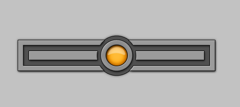
At this point it could have been either the top or the bottom of a start panel.

Next, you can see that I have started on the start panel by expanding the frame upwards. I felt that the globe image with the bars jutting out on each side would do nicely for the shutdown and searchbar area. Also notice that I have rounded off the corners compared to the image above. I've also nixed the drop shadow :

Below shows the start of a taskbar design taking place. I drew a smaller version of the "eye" for a start button which fits in nicely. Some changes on the start panel have happened as well. I changed the round "dots" that separate the 2 sides to a squared dotted line, but repurposed them as state indicators on the taskbar buttons. Also a subtle but important change overall was that I switched the lighting from 120 degrees (top left) to 90 degrees (top lit):

Now we're getting somewhere! First draft on the window frames in progress. It was at this point I felt that I actually had a skin and I should start thinking of a name. The only notable change to other areas was to square off the corners of the startpanel mouseover image:

Next, it was time to start building the skin. Up to this point, I hadn't even opened SkinStudio. I don't like to start building before I actually have a skin name. Here you can see that I added the "cutout" in the tray area to make room for the expander button. Also added a dot and cutout area to the startbutton to better mirror the window titlebar buttons. I dropped the indicator dots on the taskbar buttons due to limited space. Decided as well to go with a solid line rather than dotted line in the start panel. I could have made it work, but realized that it was out of place seeing as I didn't have a dotted line anywhere else. Also notice that I made the bars for the shutdown and search area larger just to give myself a more room to play with:


Finally, I had the skin finished. Changes done for the final version were to make the "dots" bigger on the whole skin, and finally settle on a taskbar button that I both liked and fit in with the rest of the theme:

Lastly, 2 lighter substyles for maximum usability!

Hopefully some of you found this even remotely interesting. I just wanted to share with you all how a design can evolve from a single image or even just a color combo into a full fledged skin.

5 Replies Reply 4 Referrals

And maybe the best ever series, period

Dec 21, 2020 9:00 PM by Discussion: Movies & TV & Books

The series takes place in the Fictive town of Winden (Vinden) in Germany. You might think that it is similar to Stranger Things given that the original premise is closely related. I.E. a missing boy in a small town. But you will soon realize that this is so much more.

There are a several things that set this apart from any other series that I've seen and I'll try to outline them here.

1. The 3 seasons are meticulously planned from start to finish. The modern way of TV making is often to drag out a series as long as possible to maximize profit. They'll keep it going as long as they can....as long as the interest is there. This results in many cases in a hurried and sloppy emergency wrap up on the last season (I'm looking at you GOT). You won't find this in DARK. It's 3 seasons. It was intended to be 3 seasons. The complex story needed 3 seasons to come to completion in a satisfying matter and I found myself worrying that the show runners wouldn't be able to pull it off. But incredibly, they did!

2. The actors. Both the younger and older cast do a phenomenal job! Everyone is pulling their weight here. Please watch this in the original German. Do yourself a favor and suffer through the subtitles. The casting is excellent as well (tiny spoiler). We're seeing younger and older versions of each character and you BELIEVE it!

3. Cinematography and music. The color tones and framing of each shot really plays a huge part in the storytelling. Coupled with the soundtrack gives it a creepy and unsettling mood. Just amazing!

4. The story. It's so damn confusing! I just love convoluted plots that keep you wondering WTF is going on! I think I spent at least 50% of the time scratching my head. As I stated earlier, I was worried that they wouldn't manage to land the ending, but they sure did. And if your heart isn't made of stone, you'll be like me sitting there with tears running down your face as it concludes.

I cannot overstate what an impact this series has made on me and I believe I will be judging everything I watch in the future in how it compares to Dark.


Here is a video review of the show. I think this guy does a great job explaining why you should watch it.

[video]https://www.youtube.com/watch?v=WGd0V7CiIG4[/video]

13 Replies Reply 17 Referrals

Jun 17, 2020 2:43 PM by Discussion: Skinning

Skinning is HARD. SkinStudio is CONFUSING.

I have collected a few tidibits along the way and have them saved as a txt file to reference when I forget what does what. I thought maybe I'd share this with the rest of you. Even though many already know these quirks, I'm sure that we are in a minority.

Don't look at this as a complete skinning guide. I have listed here just some of the oddities that are sometimes hard to remember. And I certainly don't have the energy to list all the mislabeled and legacy elements in SKS here.


I'll probably update this post as I remember things or are reminded of them in the comments.


The Start Menu Popup menu is not actually used where shown. However that menu IS used in 2 other places:
1. The commandbar view background with the "slider". Avoid using an image with rounded corners here, because WB will allways draw a square stroke around the menu. That stroke color is defined by the WindowFrame color in the skin defined system colors. Note: the WindowFrame color is rarely seen elsewhere but may show up in other areas like (properties dialog, Security tab and Previous Versions tabs). Text settings and mouseover image for this section are defined in the Toolbar style menubar button in the Edit toolbars section.
2. Taskbar toolbars (the flyout menu when you add a toolbar to your taskbar). Make sure you skin the menu items and define the text colors.
I think that it has always been the case that these areas have been defined through the Start Menu Popup but the difference now is that windows 10 does not have a native flyout menu so Start 10 uses the regular menu section for this.

The dropdown background and mouseover in the address bar (when you click on an arrow) is defined in the section Edit Explorer/ IE shell parts > Edit additional parts > Drop down background and Drop down mouseover.
There are no text color settings here because they are static and defined by the window text color (system color), so keep that in mind when you choose the image for your mouseover.
WB will add a stroke to this menu background, but it grabs that from an odd place (shocker). It takes the color from the outer edge of the Non captioned window edge which you will find in the UIS2 frames section.
The arrows themself (in the addressbar) are defined by the button text color in the skin defined system colors and do not change on mouseover.
Note: Button text color also effects the tiny up/down arrows in headerbars and other text in some windows/dialogs.

To skin the popup menu in the taskbar tray expander/show hidden icons, we return to the Non Captioned window edge, which as I mentioned in the section above, is found in the UIS2 frames section. Make this a solid square with no rounded corners or blank canvas around the image because WB/Win10 will add a hard-coded stroke and shadow to this image.

That's it for now. I may add reference images to illustrate at a later date. 


4 Replies Reply 9 Referrals

Jun 3, 2020 5:51 PM by Discussion: Sneak Previews

Here's the first draft of a concept design I started on today.

Mind you, this is an early draft which could change drastically as I go along!

The skin name is Sol III because that is one of the names for Earth in the ST universe and also because there are 3 styles.

Update:

Added stripes. Cuz I like stripes!


And the evolution continues. Gone, are the black stripes on the top and bottom. Simplified the black area slightly then added the colored stripe down the middle. I think less IS more here......details need to enhance the skin, not muddy the look.

Shown here with the taskbar. Buttons shown: Normal, Mouse, and Selected/Active State. Finally a comm-badge as a start button.

46 Replies Reply 7 Referrals

it's a thing

May 26, 2020 2:37 PM by Discussion: Sneak Previews

This is a design that I started on a while ago, but left "simmering" in my brain.

Problem is, I know of 2 skinners who have recently done "circuit board" themed skins recently. Then again, this design does differ significantly from the others.

What do you all think?

I would do a version where the label on the processor in the upper right, would be the user pic. The lights on the upper left would be animated (flicker/pulse or something...haven't decided yet) and the "lit" lights by the All Program and Start Button is showing the moseover/pressed/active state.

23 Replies Reply 4 Referrals

 
Page 1 of 15